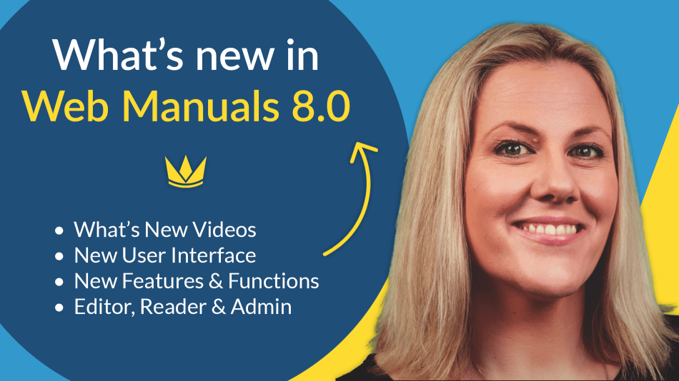
We already gave you a sneak-peek of the newest Web Manuals 8 functions in our recent blog post: What’s new? – A sneak-peek at the new and improved Web Manuals 8. Now that Version 8 is almost ready to be deployed, we have compiled a list of videos about the differences between version 7 and the new, faster, and improved version 8.
Meet one of our newest members, Jody Bright, who is going through the differences as well as the latest features in the “What’s New?” videos.
Full list of all “What’s New?” videos
– Editor (10 minutes)
– Reader (3 minutes)
– Reader dashboard (4 minutes)
– Reviewer (3 minutes)
– Admin Functions (6 minutes)
– Admin Dashboard (3 minutes)
Editor – Faster and more user-friendly
Editing manuals is our core business. Therefore we have put in a lot of thought, effort, and listened to feedback from our users. The Editor has, by far, received the most significant updates. In this video, Jody Bright is showing you everything new in the Editor.
Just as in version 7, Manage Documents provides access to your documents stored within Web Manuals. It’s now easier to handle document categories, and the document overview is clearer. To start editing a manual right away, you simply click on the manual, and you enter the editing mode.
At the top of the document we have a new layout for the document life-cycle of a manual:
Changes to Monitor in the Doc life-cycle
Under Monitor, we have grouped everything relevant for monitoring your manual. Now, you can see and add tasks; you can view the Reader, Reviewer, and editor comments. You can follow Compliance connections and cross-references.
Edit becomes Author
Since you now start editing your document right away, “Authoring” is a more relevant terminology for this improved feature. Under “Author,” we have grouped everything relevant for editing your manual. Here you can find how to:
- Change the page structure – Pages and chapters can now be moved easier.
- For the experienced user, we have added a way to add or remove pages quickly. Simply hold SHIFT and left-click to archive or delete a page, or click CTRL and left-click to add a page.
- You have the table of contents, including the expand arrow, and something new we have added is the latest edits that show the list of the latest edits that have been made in the document.
Review, Publish and Control stay pretty much the same
Review, publish, and control remain the same as before but with a different layout.
Please note that you now prepare a new revision at the top left corner of a document. Remember that to prepare a new revision; you must first save your pending changes.
Short overview of new functions and features in the Editor:
- Adding a smart module to a page has been greatly simplified. You no longer need to drag and drop the module – a simple click is now enough. As before, modules automatically update according to the changes you make in the document.
- The latest edits show the list of all the most recent edits made on the page. By clicking on “Edit” you can see what change has been made and compare the changes with the old version. By clicking on the delta sign, you can see the difference between the new section and the old section.
- Page History Shows how the page looked in each revision of the document and displays information on each revision. You can select which revision you would like to see the page in by selecting the revision name in the filter on the top of the window.
- You can now scroll through your manual vertically.
- Adding a page to your manual is now effortless and can be done by simply clicking on this plus sign below a page.
- Handling content overflow has also been greatly simplified. Simply add a new page and click on the icon shown in the video above. Please note that the next page needs to be in draft for this to work.
- Finally, as mentioned before, another great feature in version 8 is that you now can bulk save your pages all at once.
The Reader in Version 8
In the new version, you now have a more accessible and better overview of the pages in the manual. You can easily navigate through your docs through the thumbnails, the table of contents, your favorite pages, and your annotations.
- You can now also open up a PDF, without having to download it.
- The navigation bar remains the same, but now you can scroll vertically through your manuals instead of horizontally.
- Highlighting content has also changed and improved. Simply select the text, choose a color, and add your annotation.
Documents are now opened in tabs, allowing for multiple documents to be opened at the same time. To open up another manual, simply go back to the dashboard, click on documents, a category, and open a manual.
Reader dashboard – Improved
As you can see in the video above, we have a brand new layout and a more excellent overview of all the latest updates in your documentation. With this improved layout, you have smoother accessibility to your documents.
In the Dashboard, you now see:
- All your unread documents and operational critical marked documents manuals.
- You can also see your latest published documents, and if you are a reviewer, your documents to review will be shown here as well.
- The best part is – It’s fully customizable and you can display what you think is relevant for your readers.
Regarding Document Categories, we have completely redesigned the layout. We have taken our customers’ requests into account and reserved more space for longer category names.
Reviewer – New and better design
Here is what’s new in the Reviewer:
- Documents are now opened in tabs allowing for multiple documents to be reviewed at the same time.
- In Version 8, you have a more comfortable and better overview of the pages in the manual.
- You can now scroll through your manual instead of viewing every page on its own.
- You can now reject and comment on a specific piece of content.
- Now you can zoom out and view multiple pages at the same time.
New Admin Functions
In the video above, Jody will be showing you what’s new with the administrative functions and the left side blue menu in version 8. There are a lot of visual overhauls and User Interface changes. After this video, you can navigate faster. Everything also loads more quickly.
One of the most significant changes and improvements in version 8 is that you can now search for Compliance Library requirements by number. You can also now filter to see which documents are referring to the library and even filter only to see the connections to specific documents.
Manage libraries has received an IMPORTANT upgrade. Creating and maintaining your compliance libraries has been greatly simplified. Adding more lines now works like a spreadsheet.
Highlights of some more new or improved features:
- Email templates are now found under General. You can now design all outgoing emails.
- Being able to remove revision bars is now possible.
- Tags can now be created and be applied to documents to make searching better and categorizing easier.
- Document Workflows are now shown with a vertical list. The workflow items are clickable and expandable so that you can define their functionality.
- The Integrations menu item is new to version 8 and allows for a better overview and more straightforward setup of our different Sign-on providers, Partner Solutions, and Web Manuals APIs.
The Admin dashboard
Last but not least, the Admin dashboard has received some great new features as well!
- It’s fully customizable! You can display what you think is relevant.
- You can now easier access the last edited documents in the improved overview.
- On a simple verification of your email, you can have the full overview of your support tickets and keep track of their status and also send support tickets directly through your Web Manuals site.
- Finally, our help section has moved to the right side, where you will now find our useful help guides.


