During the first half of the year, we have gathered all the suggestions from our customers and developed a new interface that will enhance the user experience in general. We’re now launching a modern and improved layout with multiple new functions and a simpler design inspired by you.
This new UI will be available for all users on September 5th, where you will find the updated version with the new features. However, it’s also possible to continue with the current version if you prefer to work with the current style.
As a general upgrade, we have changed the blue color to a darker shade to increase the readability and contrast on all screens. Also, we have color-coded the buttons throughout the system. The positive buttons are now green (Save, for example); the negative buttons are red (such as Reset or Cancel); the navigation buttons are blue, and the neutral buttons are white.
Accessible Main Menu
(Watch it on Youtube) Our main menu has changed to a collapsable panel using navigability icons. Now you can shift from a text and comprehensive menu to a segmented icon-based menu. Once selected any button, the side panel will appear, providing an easier interface to navigate. On top, you’ll find a “Pin” button to decide when you want a collapsed or an open and fixed menu. Moreover, the new panel is also expandable to make it easier to see the full document or folder name.
Additionally, we have moved the Profile, Web Manuals Store, and Help Center buttons from the top right corner to the bottom left corner. Furthermore, in the Help Center you will find a What’s new section to see our newest releases, latest fixes, and upcoming developments.
Improved Documents & Categories
(Watch it on Youtube) A useful new feature is the filter option, which allows you to search both in the categories and the document list with just one click.
Likewise, to identify easily the unpublished documents, we have designed a small grey outline icon to distinguish it from the blue outline indicating a published document.
Additionally, to access and manage categories as you’re used to doing it, you will find the button “Manage Categories” on the bottom to see the full display. Nevertheless, it’s also possible to work around the categories within the new panel menu.
Functional improvements to your documents
We have added a little top number on the revision delta (𝚫), to highlight a comment in that specific change. Also, keep in mind that we moved the “Preview” button from the bottom left corner to the top right corner.
Many modifications have been implemented for the new version. Let’s go through all of them by sections:
Monitor
(Watch it on Youtube) Now it’s easier to navigate the full list of tasks! At the bottom, you’ll be able to select either “Pending”, “Completed”, or “Only my tasks” to get instant access to what you need. As well, for the “Reader comments” section, now it’s possible to select from which revisions you want to access the comments in the bottom selector.
In the Compliance subsection, we added a new sorted view where you can choose the information you need access to. At the bottom, you can select “Requirements” to see all the regulations connected to the document, which are sorted by requirement number and the specific compliance libraries. You can also select “Heading” where you can see which requirements are connected to the document according to the Table of Content. Furthermore, we have created the option “Heading (show only current page)”, to display the links on a specific page alone. And finally, we included the button “Add” to select and connect with specific headings in an easy way.
When accessing the Cross References subsection, you’ll see detailed information about the connected documents as well. Thus, now it’s possible to identify which other documents will be affected by the changes you’re performing.
Likewise, Content Mirror shows you the list of content mirror modules from and to this document. Furthermore, we have created the option “Add more Content Mirror modules”, which will give you the option to mirror another section right after each other, making it easier to create multiple mirrors.
These functionalities ease collaborations and provide a general view of the documents connected to identify faster where you can affect other files.
Author
(Watch it on Youtube) The same panel structure is replicable in this section, easing the list navigation by underlined text to indicate the page you’re actually on. Even more, now you can move pages within the document using the side panel as well, and automatically update the page number.
Review
(Watch it on Youtube) A main upgrade facilitating life for reviewers is the “Accept-Reject” top bar which now sticks and follows along when viewing the page, to avoid scrolling up and down.
The “Check for warnings” view has completely changed, now we have added a few ways to group the warnings: by page (showing a list and highlighting each page with warnings). Also by status which filtrates by the workflow status, draft, final, and the different options. And by warnings, showing only the pages with warnings.
A new major improvement is the possibility to automatically fix warnings from the side panel, shortening time in revisions.
Publish
(Watch it on Youtube) The major change in this section is the “Revision date”, which now will be in red if you have selected a day previous to the current date. This helps to keep track of the correct period of time and identify mistakes.
Easing your compliant processes
(Watch it on Youtube) We have now grouped the Compliance Libraries, for both the Web Manuals libraries and your own libraries. On settings, you’ll have the possibility to choose if you want to group them by organization in the main menu. Likewise, at the bottom, you’ll find the “Manage libraries” button to get the full list connected to your documents.
Also, when trying to include a new connection, you’ll see the full requirement text to get all the information of the regulation. Additionally, now you can select the “Not applicable” option for any library and its sub-requirements, to disable those you don’t need.
More changes in system
(Watch it on Youtube) In the panel view, now you get easy access to Designs, Custom Modules, Integrations, and Single Sign-on.
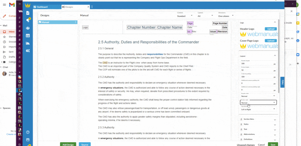
The current version has updated the options for pages design, allowing you to get all your designs listed on the left and the settings on the right. Even more, now it’s possible to change the logos by yourself. And remember, the Document archive is now in settings, no longer under documents.
And we have a final surprise for our Middle Eastern customers because now the documents allow you to write your texts from right to left. Changing this in the Layout will automatically and completely flip the content, thereby allowing for adaptation to the language of the document.


